Guidance
Cradlepoint iconography copy page link
Version 1.0.0
Icons add value to content when used in a purposeful way to reinforce copy, define action items, or explain an experience or feature. Icons increase visual interest and speed cognitive understanding, while simultaneously clarifying content hierarchy and information flow for users.
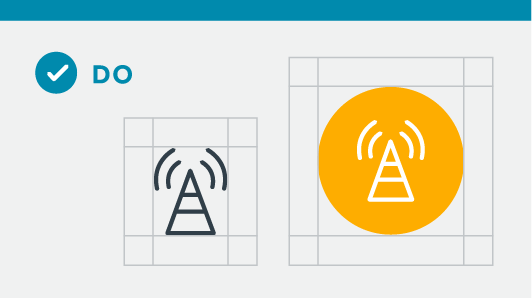
Cradlepoint has a robust library of custom icons to be used for almost everything brand. Icons should always be in one color, against a single-color background. When using several icons in a grouping, all icons should be the same height.
Icon do’s and don’ts
Best practices for using icons are detailed below.
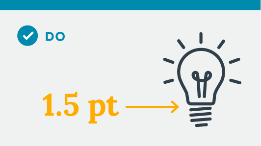
DO: Maintain consistent styling of line weight/stroke. Default stroke weight is 1.5 points, which is ideal for icons on printed A4 or letter size documents.
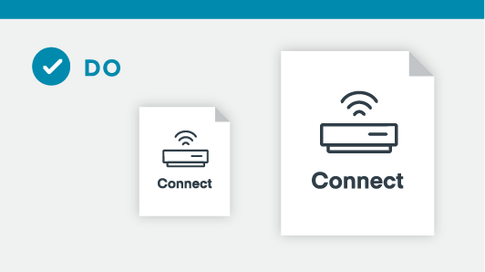
DO: Scale line weight/stroke to large or small formats.

DO: Add round caps to line stroke.
DO: Provide adequate padding between icons and text.
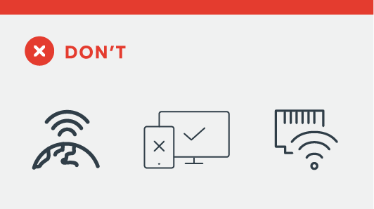
DON’T: Mix stroke weights

DON’T: Use three or more colors. Icons should always be one color, a second color can be used as a background element.
Don’t see what you need? Submit a request!
June 14th, 2024
