Guidance
Cradlepoint logo copy page link
Version 1.0.0
Our logo is composed of the Cradlepoint logotype and Signal Mountain brand symbol. The logo is crafted to represent our origins in the American Mountain West and our pioneering Wireless WAN solutions.
As a wholly-owned subsidiary of Ericsson’s Business Area Enterprise Wireless Solutions division, the Cradlepoint Part of Ericsson logo is prioritized in all global regions.
Past logos should not be used unless in a retrospective or timeline function.
To ensure clarity and visual integrity, always scale the logo lockup to the specified proportions below.
Cradlepoint part of Ericsson logo usage
The following logos are the ONLY approved lockups for the Cradlepoint and Ericsson combined brands. It is imperative that the separate logos for each brand are not combined in any other manner.
Minimum clear space: The combined Cradlepoint + Ericsson logo must have clear space equal to 1/3 the size of the Ericsson econ on the top, sides, and bottom or greater.
Minimum size: To ensure the logo is always legible, the preferred minimum width should be 1 inch or 72 pixels.
Color: The preferred logos are full color — charcoal and sunrise or white and sunrise — depending on backgrounds. When a 1-color logo is necessary, solid black or white options are available. Always ensure optimal contrast is used between the logo and background.
Orientation: The correct logo orientation is based on the space in which the logo is being placed.
Tagline
The previous Cradlepoint tagline “Connect Beyond” has been retired. Please discontinue use of this tagline in all applications.

Co-branding
When the Cradlepoint Part of Ericsson logo appears with and is promoted in association with another brand, please follow the template illustrated below.
- — Ensure clear space guidelines are followed
- — Separate the two brands with a subtle thin rule (like gray)
- — Both logos should be visually equal in size
- — Lead with the logo that supports the “sender” of the material
- — The vertical logo can be used per orientation guidelines (based on the space in which the logo is being placed), following the same rules of thumb as the stacked logo
Logo don’ts
To promote consistency of the brand and the integrity of the logo, do not modify any approved logo. Listed below are some common mistakes to avoid.
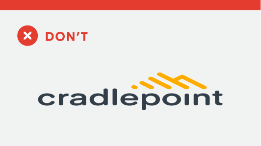
Don’t alter the proportions of the logo
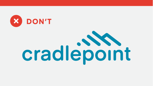
Don’t recolor the logo
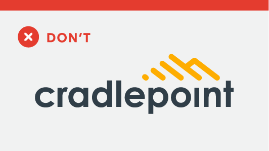
Don’t recreate the logo using another font
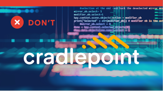
Don’t place the logo over a complex color background
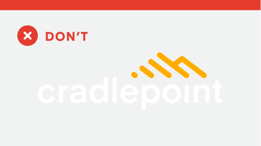
Don’t place the logo on a background with insufficient contrast
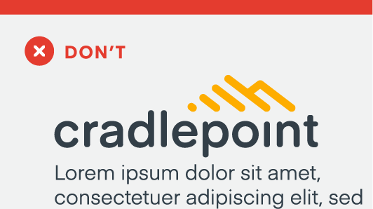
Don’t place copy or other design elements within the defined clear space of the logo
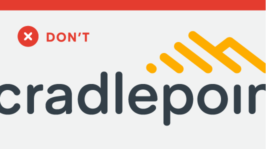
Don’t crop the logo
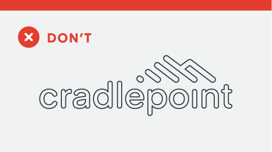
Don’t outline the logo
Don’t apply special effects to the logo
Sub-brand logos
The following logos are the most commonly used sub-brands under the Cradlepoint umbrella. All sub-brands must be developed and approved by marketing.
NetCloud logo usage
Minimum clear space: The NetCloud logo must have clear space equal to the width of the “o” in NetCloud on the sides, top, and bottom of the logo. The NetCloud Infinity Cloud symbol must have clear space equal to the height of the negative space inside of the Infinity Cloud symbol on the sides, top, and bottom.
Minimum size: To ensure the ‘by Cradlepoint’ portion of the logo is always legible, the preferred minimum width should be 1.5 inches or 108 pixels.
Color: The two-color — charcoal and river — NetCloud logo is the primary version and should be used on white or light backgrounds with sufficient contrast. On dark backgrounds the single-color white NetCloud logo is preferred.
- — If restricted to only using black and white, the solid black logo lockup should be used on white backgrounds and inversely the solid white logo lockup should be used on black backgrounds.
- — The river-color Infinity Cloud symbol should have a minimum contrast value of 3:1 on dark colored backgrounds.
IMPORTANT: The NetCloud by Cradlepoint logo appears in all lowercase letters to match the main Cradlepoint brand. However, when typeset, the N and C remain capitalized. Example: “NetCloud”
Ericom Security logo usage
Rules of engagement: Cradlepoint Part of Ericsson is the company brand and the brand we want to build. The Ericom brand transitions to a product brand, secondary in nature, similar to NetCloud by Cradlepoint. When using the Ericom Security brand, the company brand must always be prevalent and the product brand should only be introduced when the product is referenced, to keep a clear brand story for both internal and external audiences.
Minimum clear space: The Ericom Security logo must have clear space equal to the width of the “o” in Ericom on the sides, top, and bottom of the logo. The Ericom Security symbol must have clear space equal to the half the width of the symbol on the sides, top, and bottom.
Minimum size: To ensure the ‘by Cradlepoint’ portion of the logo is always legible, the preferred minimum width should be 2 inches (or 144 pixels) for the horizontal logo or 1.5 inches (108 pixels) for the stacked logo.
Color: The two-color — charcoal and river — Ericom Security logo is the primary version and should be used on white or light backgrounds with sufficient contrast. On dark backgrounds the single-color white Ericom Security logo is preferred.
- — If restricted to only using black and white, the solid black logo lockup should be used on white backgrounds and inversely the solid white logo lockup should be used on black backgrounds.
- — The river-color security symbol should have a minimum contrast value of 3:1 on dark colored backgrounds.
Orientation: The correct logo orientation is based on the space in which the logo is being placed.
Cybersecurity tagline
The previous tagline “Cybersecurity Unit of Cradlepoint Part of Ericsson” has been retired. Please discontinue use of this tagline and use of “Cybersecurity unit” in all applications; please use instead “Ericom Security by Cradlepoint”.
Ericom logo don’ts
To promote proper brand hierarchy between the parent brand (Cradlepoint Part of Ericsson) and the product brand (Ericom Security), please avoid the following usage:

Don’t use the Cradlepoint Part of Ericsson logo in close proximity with the Ericom Security logo. This creates brand hierarchy confusion. See rules of engagement for the Ericom Security logo.

Don’t use “Cybersecurity Unit of Cradlepoint Part of Ericsson” as a tagline.

Don’t exclude the ‘by Cradlepoint’ portion of the logo.
Cradlepoint University logo usage
Minimum clear space: The Cradlepoint University logo must have clear space equal to the width of the “n” in university on the sides, top, and bottom of the logo. The Cradlepoint University cap symbol must have clear space equal to the width of the ribbon on the sides, top, and bottom.
Minimum size: To ensure the Cradlepoint text portion of the logo is always legible, the preferred minimum width should be 1.5 inch or 108 pixels.
Color: The preferred logos are full color — charcoal and sunrise or white and sunrise — depending on backgrounds. When a 1-color logo is necessary, solid black or white options are available. Always ensure optimal contrast is used between the logo and background.
Cradlepoint Connect logo usage
Minimum clear space: The Cradlepoint Connect logo must have clear space equal to the width of the “n” in connect on the sides, top, and bottom of the logo. The Cradlepoint Connect symbol must have clear space equal to 1/3 the width of the symbol on the sides, top, and bottom.
Minimum size: To ensure the Cradlepoint text portion of the logo is always legible, the preferred minimum width should be 1.5 inch or 108 pixels.
Color: The preferred logos are full color — charcoal and sunrise or white and sunrise — depending on backgrounds. When a 1-color logo is necessary, solid black or white options are available. Always ensure optimal contrast is used between the logo and background.
Cradlepoint Cascade logo usage
Minimum clear space: The Cradlepoint Cascade logo must have clear space equal to the width of the “c” in connect on the sides, top, and bottom of the logo. The Cradlepoint Cascade Econ must have clear space equal to 1/3 the width of the Econ on the sides, top, and bottom.
Minimum size: To ensure the Cradlepoint text portion of the logo is always legible, the preferred minimum width should be 1.5 inch or 108 pixels.
Color: The preferred logos are full color — charcoal and sunrise or white and sunrise — depending on backgrounds. When a 1-color logo is necessary, solid black or white options are available. Always ensure optimal contrast is used between the logo and background.
Sub-brand logo don’ts
Listed below are some common mistakes to avoid when using any Cradlepoint sub-brand logo.
Don’t alter the proportions of the logo

Don’t recolor the logo

Don’t recreate the logo using another font

Don’t place the logo over a complex color background
Don’t place the logo on a background with insufficient contrast

Don’t place copy or other design elements within the defined clear space of the logo

Don’t crop the logo

Don’t outline the logo
Don’t apply special effects to the logo
June 14th, 2024

