Ericsson vs Cradlepoint brand copy page link
The evolution of our brand
We’ve experienced a lot of evolution this past year in the way we do business — brand included!
As Cradlepoint, we had flexibility: sub-brands, looser visuals, and evolving guidelines. We changed our products and our look several times in the last decade, often making up new “rules” as we went.
Ericsson is different. It’s a well-established global brand we are adopting — not building or reinventing. The Ericsson logo (the stylized “Econ” + wordmark) has been around since the early 1980s.
Read more about the Ericsson brand history
That may feel like fewer creative “toys,” but it also means more brand power behind us.
From the customer’s perspective, this matters. They should never wonder if they’re talking to Ericsson, Cradlepoint, or “some in-between brand.” Every touchpoint should look and feel like Ericsson.
Why following the rules matters
The Jersey Rule
On a football team, everyone wears the same jersey so fans know exactly who you are. Even small tweaks — an extra stripe, a splash of color — make a player look “special” instead of part of the team. To fans, that creates confusion: “Wait, are they still on the same team?”
Brands work the same way. When we all wear Ericsson’s jersey — logo, colors, fonts, typography — we show up as one team. When we start creating new marks or variations, it weakens the brand. That’s why Ericsson’s stricter rules exist: one jersey, one brand, one team.
The Telephone Game
If the brand starts strong but each person tweaks it along the way, the message quickly morphs into something unrecognizable. With thousands of employees and agencies touching Ericsson’s brand, strict rules are the only way to keep the story intact.
| Bottom line: The rules aren’t about limiting creativity — they’re about playing as one team, in one jersey and by the same rule book, so we win together. |
How you can help: Know the rules
Here are some high-level core Ericsson brand elements and basic rules to play by.
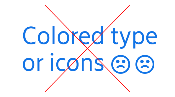
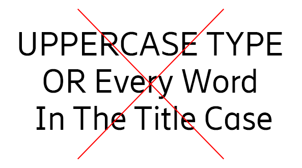
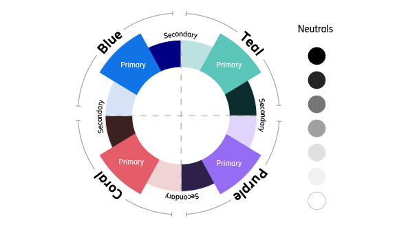
Color
Use the updated Ericsson brand colors for consistency across the company.
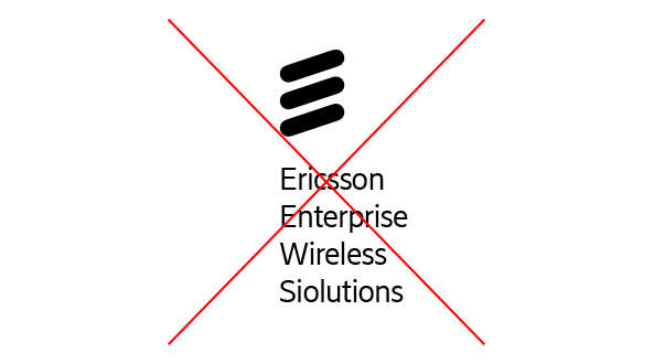
Identifiers
Use only for products, services, and events, not for business units or teams.
Icons
Use Ericsson’s library only, don’t make your own or mix and match from the old brand.
August 28th, 2025